
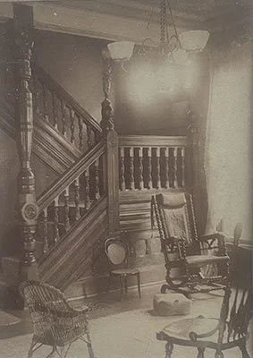
The waaaaaayyyyyy before image.
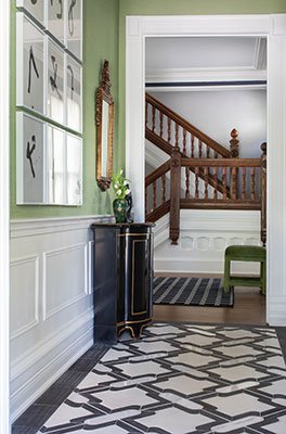
This entryway and parlor has seen some changes, but the gorgeous staircase stayed just the same. Photo Credit: Kristi Hughes Photography.
What made this project such a meaningful one for your team?
Bryn: This project was really a continuation of a story we'd been telling for more than a decade. We first worked with this family years ago, when the original owner of Two Hands Interiors had just sold the business to Rachel, and we had the privilege of designing the original living spaces in their Oak Park home. These clients have an artistic eye, they appreciate the mix of old and new, and they genuinely enjoy the design process together. When they decided to add onto the house, they already had architectural plans, but they wanted us to shape how the new spaces would function and feel. Returning to a home you already know — and clients you truly enjoy collaborating with — is always special.
How did the family want to live in this home?
Bryn: This family wanted a home where cooking dinner, helping with homework, reading by the fire and entertaining friends could all happen naturally in one shared space. The kitchen, breakfast room and keeping room became the heart of the house — a place where life overlaps throughout the day. We kept telling them, "You're going to live in this keeping room. It's small, but it's going to live large.”
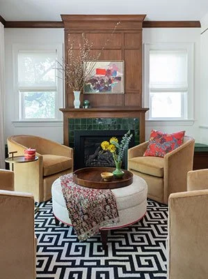
The keeping room has become the heart of the home. Photo Credit: Kristi Hughes Photography.
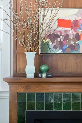
We chose this green tile because the family loves green and it looks like it could’ve always been here on this fireplace surround. Photo Credit: Kristi Hughes Photography.
Why bring back the keeping room?
Bryn: We love the history behind the keeping room. The keeping room began as the warm heart of the Colonial home, a cozy space beside the kitchen hearth where the family gathered, relaxed and stayed warm. Today, it still captures that same sense of comfort, connection and everyday living.
Rachel: One of my favorite quotes is from the homeowner about 6months after they had moved into the completed space. He said, “Bryn was right, the keeping room really is the best room.”
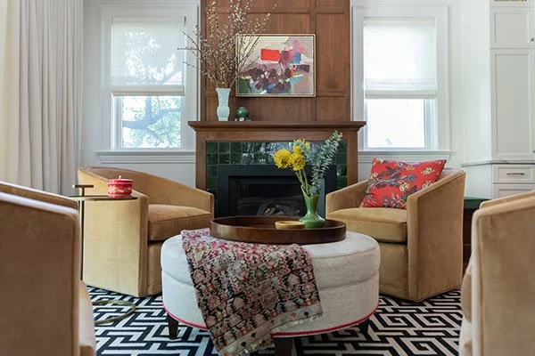
The keeping room is located at the intersection of the kitchen, the back deck and the breakfast room. Photo Credit: Kristi Hughes Photography.
Why make the mudroom one of the boldest spaces in the house?
Bryn: The homeowners wanted their kids and kids’ friends to enter through the back door and immediately have a "wow" moment in the mudroom, which led us to Schumacher's iconic Josef Frank Citrus Garden wallpaper. From there, every cabinet was custom designed down to the eighth of an inch. We sized shoes for every member of the family — from their dad who is very tall and their son who is catching up — and created concealed storage for their shoes, coats, sports equipment and everyday clutter. We always joke that you can't engineer the mess out of your family, but you can certainly put it behind beautiful cabinet doors.
Rachel: I’m a believer that spaces that contain clutter actually shouldn’t be neutral. Think about it - if you have a white and gray mudroom every single jacket, shoe, and bag is going to be highlighted against that neutral palette (as much as everyone hopes folks will put things away, they don’t!) In this mudroom, all you are ever going to notice is the beautiful cacophony of color and movement, not the stuff that inevitably makes its way to the floor.
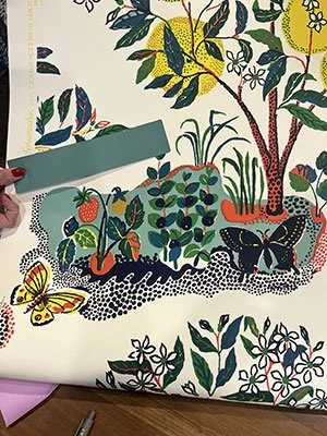
This wallpaper is just iconic.
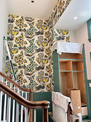
This mudroom wallpaper was one of the jumping off points for the design of this home. Photo Credit: Kristi Hughes Photography.
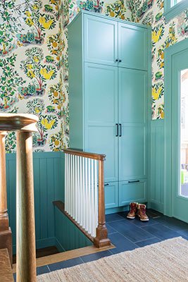
This space creates a “wow” moment. Photo Credit: Kristi Hughes Photography.
How has the dining room evolved over time?
Rachel: Prior to the big reno we had freshened up the dining room with some pretty wallpaper, a new light fixture and a rug. While the paper and fixture had to go in this new iteration we did keep the rug (which had been an investment) and pulled the room’s palette from that, it’s a good reminder that investing in quality pieces often means you can use them in various iterations of rooms over the years.
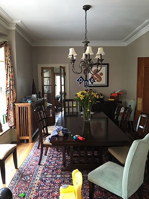
This was the starting place for the dining room.
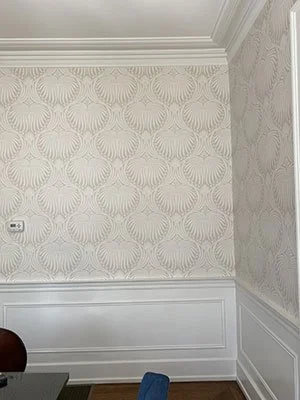
Before the addition, we gave this dining room a refresh with this beautiful wallpaper.
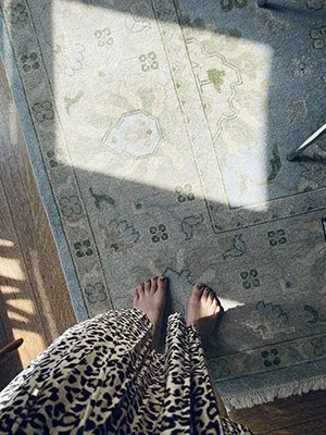
This rug has stood the test of time.
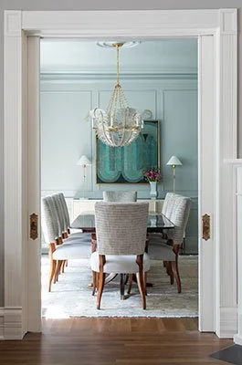
The current state formal dining room is gorgeous with a gleaming ceiling, a feather chandelier and original art by Marissa Voytenko. Photo Credit: Kristi Hughes Photography.
What was the biggest design challenge in the addition?
Bryn: Because the addition had already been designed before we joined the project, thoughtful space planning became everything. The breakfast room needed to comfortably seat a family of five while maintaining clear pathways between the kitchen, mudroom and deck. The answer was a custom corner banquette — one of our favorite ways to maximize seating without sacrificing circulation.
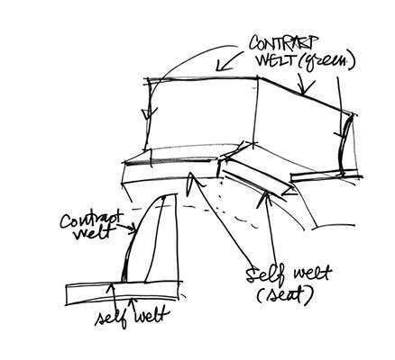
A scribbled plan is often the starting point of our designs.
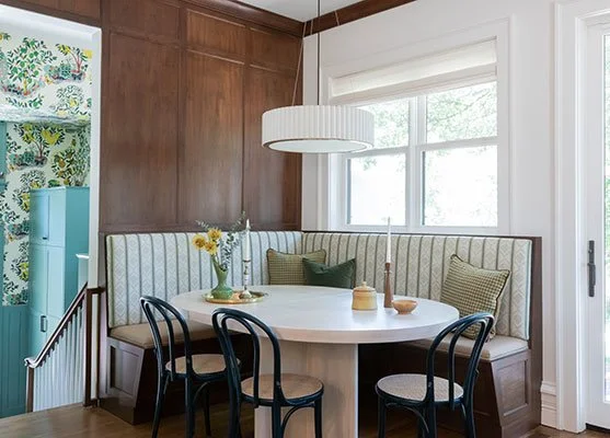
A custom banquette to save the day! Now the chairs have all the pull-out clearance they need. Photo Credit: Kristi Hughes Photography.
What was the vision behind the kitchen?
Rachel: The kitchen our clients inherited when they purchased the home was circa 1990 – it was in the center of the home, closed off with one window and three doorways to different spaces. It was dark, small and ultimately really annoying for our clients. The kitchen was actually the smallest room on the entire first floor – a holdover from the era the home was built in.
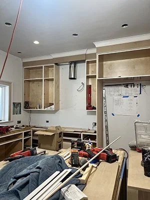
This kitchen has come a long way.
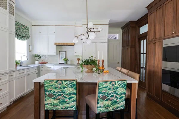
We brightened up this kitchen with white custom cabinetry, grounded it with the stained custom cabinetry and gave it a lot of one-of-a-kind elements from custom barstools to the cool Kravet light fixture. Photo Credit: Kristi Hughes Photography.
Were there any small details that required an outsized amount of thought?
Bryn: Absolutely. One of our favorite moments is a tiny drop zone tucked into the original part of the home. It was only a few inches deep, but the family needed a place for keys and mail. We designed a marble-topped built-in with concealed storage that feels like it has always belonged there. It's one of those quiet details that solves an everyday problem while honoring the character of an older home.
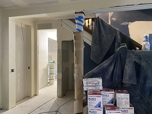
This space would become the crucial catchall for the family’s keys, mail and other odds and ends.
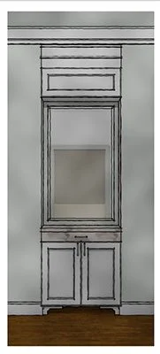
This was the plan we came up with for this tiny footprint.
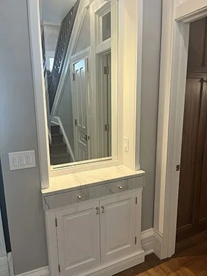
Here's how the space turned out.
How did the history of the home influence the design?
Bryn: This house has evolved over generations. It began as a Victorian before Tudor Revival details were added, and it's located within Oak Park's Frank Lloyd Wright Historic District. Rather than trying to make the addition look purely Victorian or purely Tudor, we focused on materials with timeless character — artisan tile, stained wood cabinetry and finishes that feel as though they've always belonged. The goal wasn't to imitate history but to continue it.
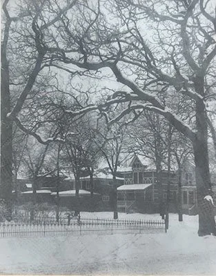
This home has a lot of history.
Where did the design story begin?
Bryn: The Josef Frank wallpaper was one of our very first selections, and it informed so many of the decisions that followed. Green became another common thread because it's a color the homeowners naturally gravitate toward. You'll see it woven throughout the house — in the fireplace tile, upholstery, cabinetry and bar stools. Alongside those elements are handmade tile, antiques and richly layered materials that give the home its collected feeling.
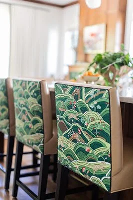
The “Rolling Hills” fabric on these kitchen barstools is just gorgeous. Photo Credit: Kristi Hughes Photography.
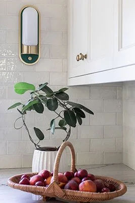
The little pop of green on this Urban Electric sconce! Photo Credit: Kristi Hughes Photography.
What was the vision for the primary suite?
Bryn: One of the homeowners travels internationally for work and wanted the primary bathroom to feel like a boutique hotel. That became our design challenge. Marble surfaces, a steam shower, a soaking tub and layered lighting transformed the space into a retreat that feels luxurious without feeling disconnected from the rest of the house.
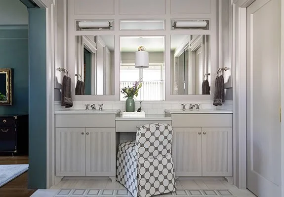
Pocket doors separate the primary bathroom from the bedroom. Photo Credit: Kristi Hughes Photography.
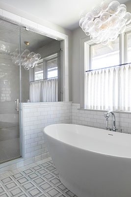
This primary bathroom gives off serious hotel spa vibes. Photo Credit: Kristi Hughes Photography.
What was the thinking behind the other bathrooms?
Rachel: Powder rooms and kids’ bathrooms are an invitation for fun … we stuck with relatively timeless tile packages in the bathrooms – subway tile with accents of historic color -- but went big on wallpaper and lighting -- things that can change out over time.
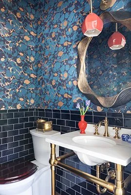
Drama is the name of the game for this powder room on the main level. Photo Credit: Kristi Hughes Photography.
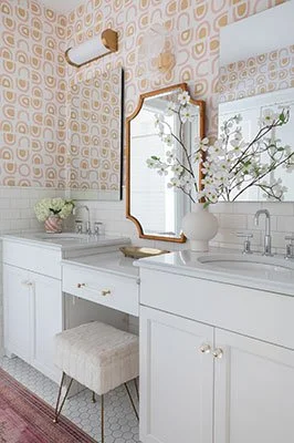
A sweet bathroom for our clients’ daughters. Photo Credit: Kristi Hughes Photography.
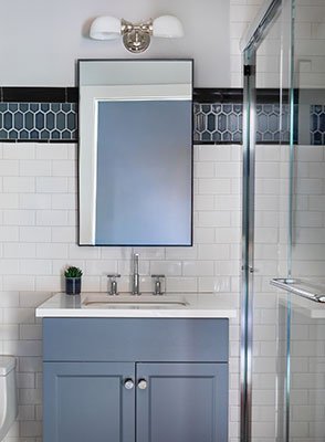
The tiling gives this boys bathroom some extra pizzazz. Photo Credit: Kristi Hughes Photography.
What do you think makes this home feel so timeless?
Bryn: It's stylish without following trends. Every decision — from the wallpaper and lighting to the antiques and artwork — was made specifically for this family. We layered old with new, incorporated meaningful art and custom details, and created spaces that feel deeply personal rather than perfectly prescribed. To us, that's the point of hiring a designer.
