
Rachel and Bryn sat down to chat about a recent row home project they wrapped late last year. Taking all the parts of the homeowner’s hobbies and interests – vintage car enthusiast, wine connoisseur, world traveler, dapper dresser, amateur mixologist – and bringing them together into a sophisticated, functional design that nods to it all was an exciting opportunity. Here are some of the lessons they learned along the way and big moments to highlight.
What was the original vision for this home — and how did it evolve over the course of the project?
Bryn: When our client first came to us, he was purchasing a high-end row home with semi-custom options in a development where many features came standard. From the start, his directive was clear: “I don’t want mine to be like everyone else’s.” We were happy to hear that, because we felt the same. While the development’s model home was polished, modern, and undeniably appealing, we knew we wanted to take a different approach — especially with lighting, millwork and other elements. At the same time, the model helped us understand what he did respond to, allowing us to identify elements we could thoughtfully build upon.
Rachel: While he was clear that he wanted his home to feel distinct from the others in the development, he wasn’t entirely sure what that meant yet. He leaned contemporary but also appreciated traditional detail, so it was up to us to shape the vision. We took cues from his personal style. He’s a snappy dresser with beautiful suits, good shoes. He drives a nice car — which all led us toward a tailored, masculine approach with clean lines and an emphasis on the finer things.
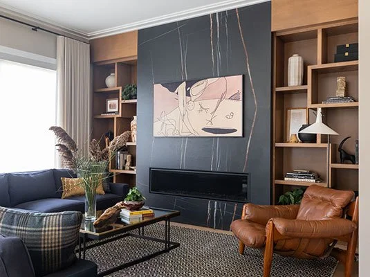
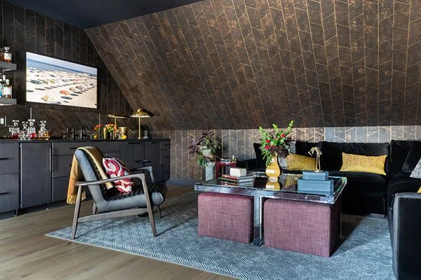
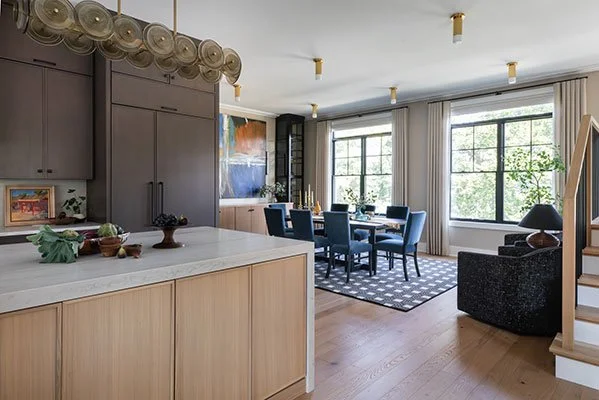
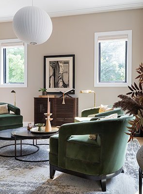
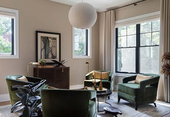
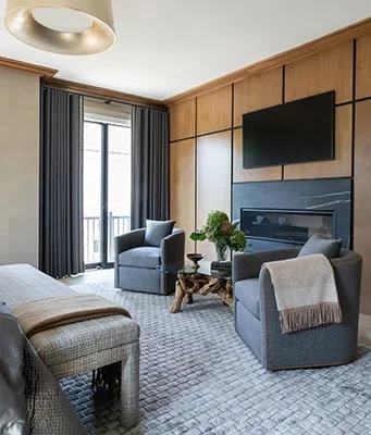
This living room is the heart of this 20-room home. Photo Credit: Kristi Hughes Photography.
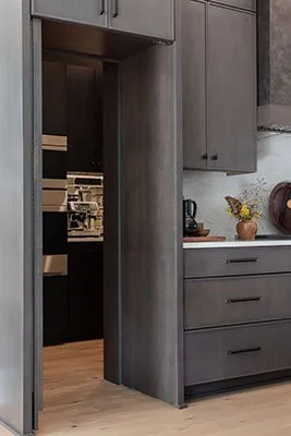
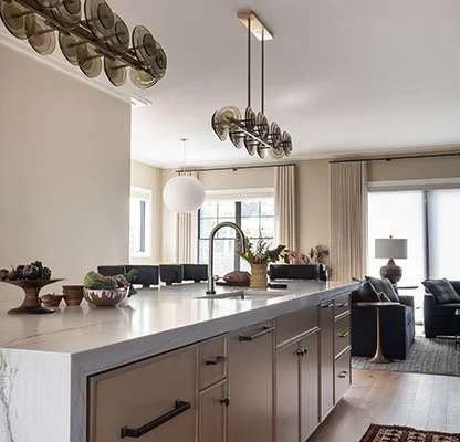
This kitchen has a hidden door that leads to a hidden scullery. Photo Credit: Kristi Hughes Photography.
How did your collaboration with builders play a role in the project?
Bryn: In a planned development, things are usually pretty prescribed — what you can do and who you work with. Fortunately, the general contractor was fantastic. We’d bring him what were sometimes fairly ambitious ideas, and he was always game to figure out how to make them happen. A sauna. A fully temperature-controlled wine room. In a row home, those aren’t easy feats when you’re dealing with mechanicals and fire walls, so we were genuinely grateful to have a partner willing to go down those paths with us.
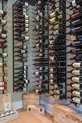
A climate controlled wine room - yes, please! Photo Credit: Kristi Hughes Photography.
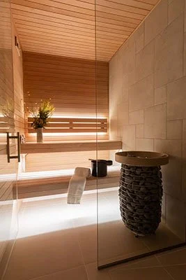
We also worked with the builder to install a sauna in the row home. Photo Credit: Kristi Hughes Photography.
Were there any specific client requests that became defining moments in the design?
Rachel: He had a solid art collection, though not all of it would translate to the new space — and he wanted room to keep collecting. We turned the first-floor entry into a gallery that could support a rotating set of pieces and make an immediate impression upon entry. The fourth-floor media loft also revealed itself as something really special – not just an ancillary space – it became a true room in its own right, designed for everyday use.
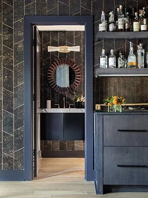
Our client gets to play mixologist in this moody space that opens up onto a deck. Photo Credit: Kristi Hughes Photography.
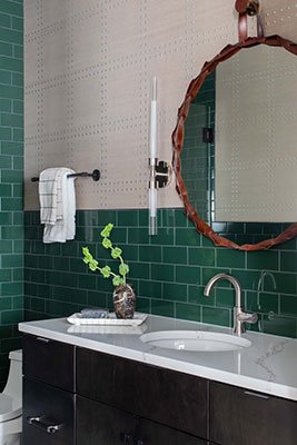
This powder room was quite a feat to pull off with its floating vanity and rearranged plumbing and floating vanity. Photo Credit: Kristi Hughes Photography.
Bryn: He’s an amateur mixologist, so we designed the fourth floor as a place to make drinks and entertain, taking full advantage of the beautiful views off the deck. He was also very focused on the two-story stair volume in the entry and wanted a standout light fixture. While the model home had an interesting fixture, we wanted to push it much further — and thanks to Rachel discovering a great lighting company in Minnesota, Hennepin Made, we were able to create something truly special.
Rachel: What really sold Bryn and me on the light fixture was visiting the factory and meeting the artisans blowing the glass — seeing the entire process, from concept to finish. Knowing the materials were sourced and crafted stateside, by real hands in Minneapolis, made it especially meaningful. That story mattered to us, and it helped us sell the piece to the client as well. Many of our clients truly value that connection from source to finish.
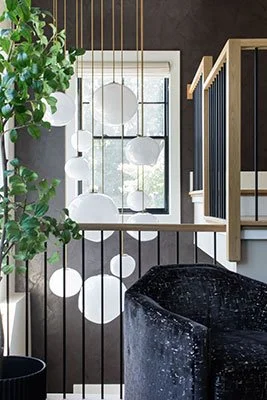
This light fixture with hand-blown glass from Hennepin Made is just the show stopper our client was looking for. Photo Credit: Kristi Hughes Photography.
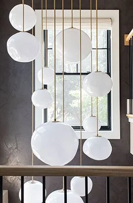
Against a two-story backdrop of textured wallpaper, this custom light fixture really shines. Photo Credit: Kristi Hughes Photography.
How did you approach space planning in a row home format?
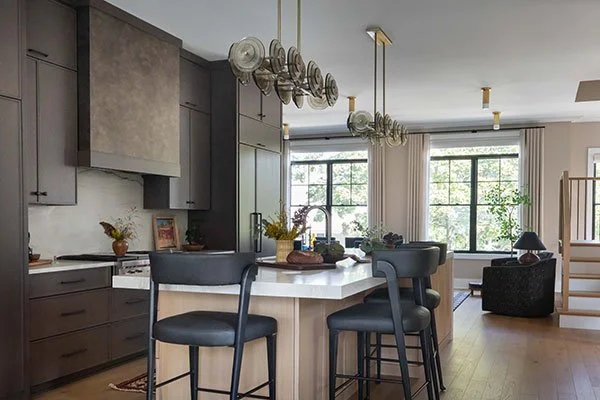
Bryn: All of the units came with a standard center kitchen — an island and a run of cabinetry meant to house the fridge and range — which works well for most buyers. But he already had a relationship with Sub-Zero, Wolf & Cove knew exactly which appliances he wanted, and genuinely geeked out over great equipment. Our challenge was figuring out how to incorporate everything without sacrificing storage. The solution was a hidden scullery tucked behind cabinetry, giving him roughly 50% more space for appliances and storage without it being visible. It completely reframed the kitchen and stayed true to his goal of creating something distinct from the other units.
Rachel: We are seeing the rise of the butler’s pantry/scullery and it really illustrates the idea of how nice it can be for clients to have an enclosed place to put all the extra appliances and the messy stuff–especially in a kitchen that is open. It’s a part of every room on the main floor.
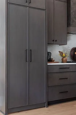
This cabinet door conceals a gorgeous set of appliances. Photo Credit: Kristi Hughes Photography.
Ta da! A doorway to 50% more kitchen space. Photo Credit: Kristi Hughes Photography.
Another move that set the project apart was how we approached the dining room. It was generously sized — almost oversized for the unit — and we didn’t want it to feel like a big, empty space. Instead of centering a fixture over the table, we used semi-flush surface-mounted lighting throughout the room, which freed the table to shift off-center. That move allowed us to introduce two armchairs and create a more layered seating area — a place to pull up with a glass of wine from the wine room. It gave the dining room a sense of intentional scale and flexibility rather than emptiness.
Without a centered light fixture over the dining table, we opted for a lighting approach that lent more flexibility. Photo Credit: Kristi Hughes Photography.
We designed a bonus seating area to solve for an oversized footprint in the dining room. Photo Credit: Kristi Hughes Photography.
What design strategies did you use to maximize light and flow?
Rachel: We kept a tight paint palette, which works well in such an open space. When we did shift colors, we went bold — the media loft is wrapped in saturated wallpaper, and the primary bedroom in rich wood paneling. Nearly all the drapery, needed for privacy in this corner unit, uses the same tonal fabric as the walls, adding texture and depth without strong contrast.
Many of the windows are covered with a combo of blinds and drapery. Photo Credit: Kristi Hughes Photography.
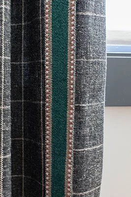
Here's another example of refined, masculine drapery. Photo Credit: Kristi Hughes Photography.
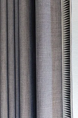
The drapery takes cues from men’s suiting throughout the home. Photo Credit: Kristi Hughes Photography.
Bryn: And in addition to the drapery, there are Lutron motorized blinds throughout his entire house. When you’re standing on the outside of the house, there’s a lot of continuity for the whole unit.
Lutron blinds on the windows create a sense of continuity. Photo Credit: Kristi Hughes Photography.
This sun-lit room uses a mix of blinds and drapery. Photo Credit: Kristi Hughes Photography.
Any details that may not be immediately visible that enhance daily living?
Bryn: In his primary suite, the original plan was to have the bathroom open to the primary bedroom (with no door) and there was also no door from the bathroom to the walk-in closet. To bridge his desire for openness and our recommendation of a bit of privacy and closure in the bathroom space, we did a jib door ( a hidden door) in this beautiful wood clad wall, so when the door is shut, it looks like a wood wall – but he has the ability to make it disappear, and we also connected the bathroom to the walk-in closet.
This beautiful wood clad wall conceals the doorway to the primary bathroom. Photo Credit: Kristi Hughes Photography.
And there she is! Photo Credit: Kristi Hughes Photography.
Rachel: The paneling and the jib door in the primary bedroom is really a great testament of the synergy between designers and builders, the trades and the construction teams because that definitely took some finesse and in-the-field decisions about how to line things up and what was going to work best functionally and I thought that DJK really did a great job of listening to what was important to us and then making it happen.
The primary bedroom is a gorgeous bespoke space. Photo Credit: Kristi Hughes Photography.
Just beyond the seating in the primary bedroom is the jib door that leads to the bathroom. Photo Credit: Kristi Hughes Photography.
In a luxury build, are there places where you can pull back?
Bryn: One thing that we did was more builder grade – you wouldn’t know it as you walked in – is the floor tile that we used throughout. The floor tile wasn’t a place where we thought dollars needed to be spent. It was going to be hard working in the mudroom, given that he is a car guy he’d be coming in and out from the garage to wash his hands or change out of his work clothes.
Rachel: The guest bedrooms even though they look nice and they’re functional, we didn’t spend a lot of dollars and design time on those. They’re good enough for what they need to be but they don’t have anything in them so precious that if a guest or a grandchild bumped into something, that it wouldn't be heartbreaking versus his primary bedroom which is special and has finishes to be careful with in there.
An extra bathroom, which is beautiful but pulled back compared to other spaces in the luxury home. Photo Credit: Kristi Hughes Photography.
This guest room is lovely and functional but also understated compared to other rooms in the home. Photo Credit: Kristi Hughes Photography.
What’s the biggest design challenge you overcame? Also, what’s your favorite room in the home?
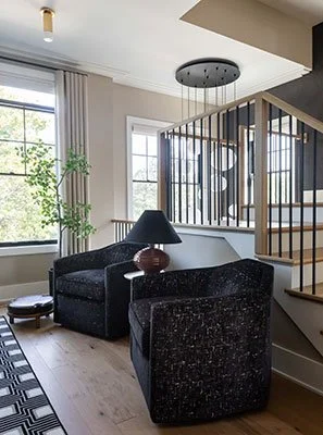
Rachel: When you have such openness and volume, it’s about celebrating that with the views, the flow, the light but making it human scale and that’s where you need the hand of good textiles, good layouts that are cozy and that can work for a single person and for a party. Also, the living room is a great space.
Bryn: And nobody wants a home where there are spaces you don’t use or go in, so we’re proud of the way that there really aren’t rooms in this project that aren’t used. Other than the guest rooms, which are infrequently used because they’re guest rooms, so I think that’s a huge win. But I’d say my favorite space and the heart of the home is that second floor, which includes the living room.
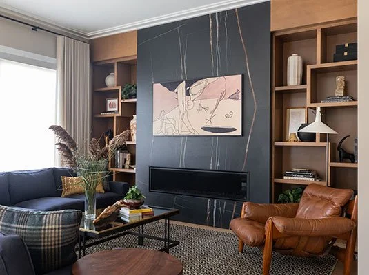
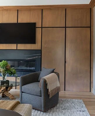
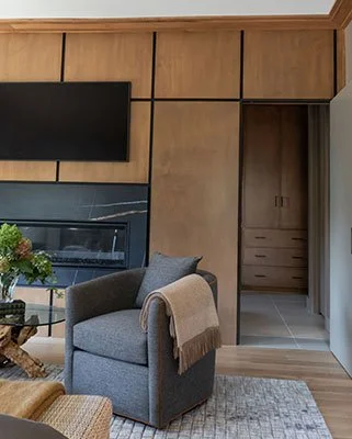
The custom book shelves are a standout piece in this room. Photo Credit: Kristi Hughes Photography.
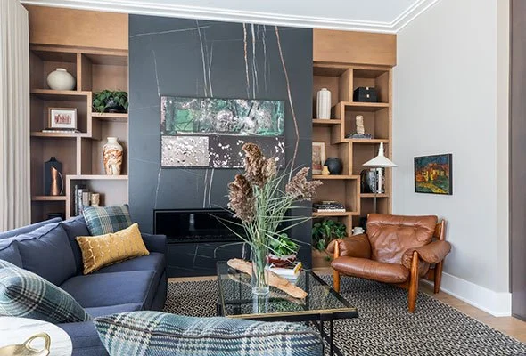
The slab fireplace is another gorgeous bespoke element in the living room. Photo Credit: Kristi Hughes Photography.
Learn more about full-service design. Design Services — Two Hands Interiors