
Step inside The Guild in downtown Wheaton and you’ll quickly notice that every color, texture, and pattern was chosen to create a sense of warmth, nostalgia and discovery. Inspired by classic European bookstores and layered London interiors, interior designer Rich paint colors, two-toned stained shelves, and thoughtful materials helped shape the inviting atmosphere behind this one-of-a-kind bookstore, café, and bar experience.
What was the inspiration behind the look of The Guild in Wheaton?
The inspiration for The Guild originated with Kurt Fritz, whose vision was to create a London-inspired bookstore experience in Wheaton. From the beginning, the goal was to design a space that immediately transports guests with a timeless European atmosphere that is rich in character, warmth and Old World charm.
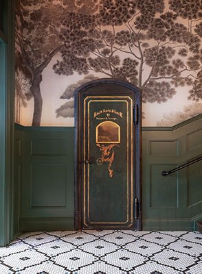
Photo Credit: Kristi Hughes Photography.
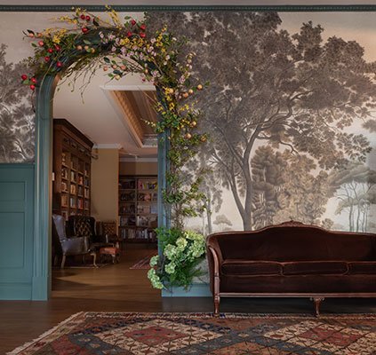
Photo Credit: Kristi Hughes Photography.
How did you determine the color scheme in the foyer?
The foyer color palette was built around our primary wall color, “Goodwin Green” by Benjamin Moore. This deep hunter green serves as a sophisticated neutral that pairs easily with a wide range of complementary tones and textures. It creates a welcoming, moody foundation while reinforcing the classic European aesthetic throughout the space.
What paint colors did you choose to incorporate in the bookstore “Sage and Scroll to create its classic European charm?
For the custom bookcases, we selected “Dinner Party” by Benjamin Moore. This rich and refined red adds depth and warmth without feeling overpowering. The tone enhances the bookstore’s traditional character while also allowing the books themselves to stand out beautifully against the shelving.
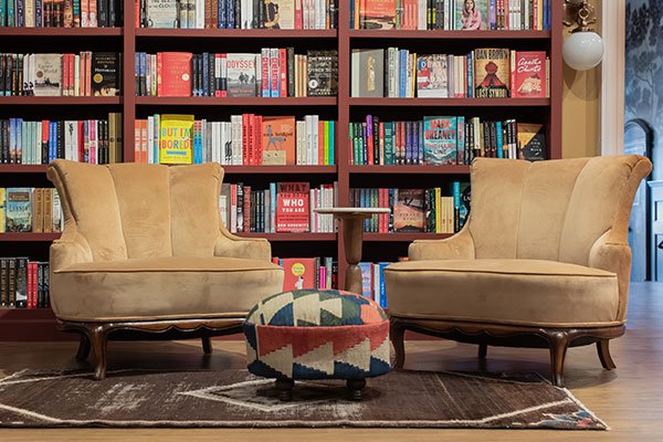
Photo Credit: Kristi Hughes Photography.
What inspired you to use stained wood on some of the shelves?
I drew inspiration from a visit to the Neue Galerie in New York City last year. Within the library foyer, I was particularly inspired by the beautifully crafted bookcases featuring a lighter maple stain on the back panels. That detail added warmth, depth, and a subtle contrast that highlighted the books in a very elegant and inviting way.
What influenced your decision when choosing the main wall color for the bookstore?
We knew from the start that we wanted the bookstore to feel warm, intimate, and inviting. Because the space receives limited natural light, it was important to select a wall color that would create a soft glow and cozy atmosphere throughout the day. This one is Benjamin Moore’s “Coffeehouse Ochre.”
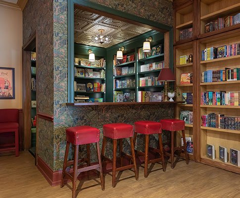
Photo Credit: Kristi Hughes Photography.
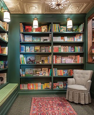
Photo Credit: Kristi Hughes Photography.
We started the design on this primary bedroom knowing our client wanted drama! But also somewhere still relaxing enough for sleep. The bold mural in neutral tones opens the room up into a peaceful panoramic.